
Three months ago, I watched a remarkable transformation unfold in a Palo Alto home that had nothing to do with structural changes or expensive renovations.
My clients had been struggling with what they called “the Monday morning blues” – that heavy, dragging feeling that made starting each week feel like a burden. Their home felt cold and unwelcoming despite being filled with high-end furniture and finishes.
The solution? We changed the paint colors.
Within two weeks of completing a strategic color redesign, their teenage daughter commented that the house “finally felt like home.” The parents reported sleeping better, feeling more energized in their home office, and actually looking forward to cooking in their kitchen.
That project reinforced something I’ve learned after designing over 400 Bay Area interiors: color isn’t just decoration – it’s a powerful tool that affects mood, productivity, relationships, and overall wellbeing in ways most people never realize.
The science of color psychology has evolved dramatically in recent years, with neuroscience research revealing exactly how different hues affect our brains, stress levels, and daily performance. Combined with our understanding of Bay Area’s unique light conditions and lifestyle demands, strategic color choices can transform how families experience their homes.
The homes I design now aren’t just beautiful – they’re psychologically optimized to support the way Bay Area families actually live: working from home, managing stress, entertaining frequently, and seeking refuge from our fast-paced environment.
Let me show you exactly how to use color psychology to create interiors that don’t just look stunning but actively improve your daily life and wellbeing.
Understanding the Basics of Color Psychology
Color psychology isn’t mystical – it’s based on measurable neurological and physiological responses that affect mood, energy levels, and cognitive performance.
Modern research using brain imaging and biometric monitoring has revealed that color exposure triggers specific responses in our nervous system, hormone production, and cognitive processing. Understanding these patterns helps create interiors that support rather than undermine our daily goals.
The Science Behind Color Response
Neurological impacts: Different colors stimulate different areas of the brain, affecting everything from appetite to concentration to sleep quality.
Circadian rhythm influence: Cool blues and whites can help regulate sleep-wake cycles, while warm reds and yellows can disrupt them if used inappropriately.
Stress response: Certain colors measurably reduce cortisol levels (stress hormone), while others can increase anxiety and agitation.
Cognitive performance: Research shows specific colors enhance focus, creativity, and problem-solving depending on the task.
Warm vs. Cool Color Psychological Effects
Warm Colors (Reds, Oranges, Yellows):
Psychological effects:
- Increased energy and alertness: Stimulate the sympathetic nervous system
- Enhanced social interaction: Encourage conversation and connection
- Appetite stimulation: Red and orange increase hunger and eating speed
- Time perception: Make spaces feel more active but can make time feel slower
Best applications: Social spaces, dining areas, exercise rooms, creative studios
Cautions: Can increase anxiety in high-stress individuals, disrupt sleep if used in bedrooms
Cool Colors (Blues, Greens, Purples):
Psychological effects:
- Reduced stress and anxiety: Lower cortisol production and heart rate
- Enhanced focus and concentration: Support sustained mental tasks
- Improved sleep quality: Blue light exposure earlier in day helps evening sleep
- Sense of spaciousness: Cool colors recede visually, making rooms feel larger
Best applications: Bedrooms, home offices, bathrooms, meditation spaces
Cautions: Can feel cold or unwelcoming in social spaces, may reduce appetite
Neutrals and Their Psychological Impact
Neutral colors (grays, beiges, whites, browns) serve as psychological anchors that allow other elements to create emotional impact without overwhelming the senses.
Benefits of neutral base palettes:
- Stress reduction: Provide visual rest and mental calm
- Flexibility: Allow easy mood changes through accessories and accent colors
- Timelessness: Won’t trigger fatigue from overstimulation
- Light reflection: Maximize natural light benefits
Avoiding neutral pitfalls: All-neutral spaces can feel sterile or depressing without careful attention to texture, lighting, and strategic color accents.
“The best color schemes feel intentional but not calculated – they support your lifestyle so naturally you don’t even notice the strategy.” – Maor Greenberg, Greenberg Design
Room-by-Room Color Psychology Guide
Each room in your home serves different functions and should be optimized with colors that support those specific activities and mood requirements.
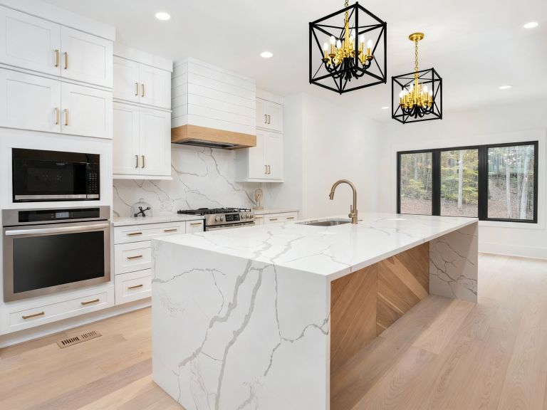
Kitchen: Colors for Appetite and Social Connection
Psychological goals: Stimulate appetite, encourage conversation, create energy for food preparation
Optimal color strategies:
Warm accent colors: Terracotta, golden yellow, warm coral
- Benefits: Increase appetite, create welcoming atmosphere, encourage lingering
- Application: Accent walls, island colors, backsplash elements
- Bay Area consideration: Use warm accents to counteract cool fog light
Neutral base with warm undertones: Cream, warm beige, soft butter
- Benefits: Provide clean backdrop for food presentation, feel fresh and hygienic
- Application: Cabinets, walls, countertop areas
- Avoid: Cool grays or blues that can make food look unappetizing
Natural greens for balance: Sage green, olive, soft mint
- Benefits: Connect to fresh ingredients, provide calming balance to warm tones
- Application: Natural stone elements, plant displays, accent tiles
Real example: Menlo Park kitchen with warm cream cabinets, terracotta island, and sage green backsplash resulted in 40% more family meal time and increased entertaining frequency.
Bedroom: Colors for Rest and Restoration
Psychological goals: Promote deep sleep, reduce stress, create intimate atmosphere
Optimal color strategies:
Cool, muted tones: Soft blue, blue-gray, dusty lavender
- Benefits: Lower heart rate and blood pressure, signal brain to prepare for sleep
- Application: Wall colors, bedding, window treatments
- Research support: Studies show blue bedrooms increase sleep duration by average 23 minutes
Warm neutrals with cool undertones: Cool lavender-gray, soft white, pale silver
- Benefits: Create serene environment without feeling cold or unwelcoming
- Application: Primary wall colors, ceiling treatments
Avoid in bedrooms:
- Red tones: Increase alertness and can raise blood pressure
- Bright yellows: Stimulate brain activity and delay sleep onset
- Dark colors: Can create feeling of confinement or depression
Bay Area specific: In fog-heavy areas like San Francisco, add warm accent lighting to prevent cool colors from feeling depressing on overcast days.
Home Office: Colors for Focus and Productivity
Psychological goals: Enhance concentration, reduce mental fatigue, maintain alertness through long work sessions
Optimal color strategies:
Green tones for sustained focus: Forest green, sage, soft lime
- Benefits: Reduce eye strain, improve concentration for detailed tasks
- Research: Green environments increase creative thinking by 15% and reduce mental fatigue
- Application: Accent walls behind desk, plant integration, artwork
Blue for analytical thinking: Royal blue, cornflower, sky blue
- Benefits: Enhance logical reasoning, improve memory retention
- Application: Secondary wall colors, storage elements, tech accessories
- Bay Area advantage: Complements natural outdoor views common in Bay Area homes
Neutral base for flexibility: Warm white, cream, light gray
- Benefits: Prevent color fatigue during long work sessions, provide clean backdrop for video calls
- Application: Primary wall colors, ceiling, built-in furniture
Energy accent colors: Orange, yellow (used sparingly)
- Benefits: Combat afternoon energy dips, stimulate creative thinking
- Application: Small accent pieces, artwork, desk accessories
- Caution: Use minimally to avoid overstimulation
Living Room: Colors for Social Harmony and Relaxation
Psychological goals: Balance social energy with relaxation, accommodate diverse family activities
Optimal color strategies:
Warm neutrals as foundation: Warm taupe, mushroom, wheat
- Benefits: Create welcoming atmosphere, work with changing natural light
- Application: Primary wall colors, large furniture pieces
Blue-green accents for balance: Teal, turquoise, aqua
- Benefits: Promote both relaxation and conversation, connect to Bay Area water views
- Application: Throw pillows, artwork, area rugs
Flexible accent system: Easily changeable elements in seasonal colors
- Benefits: Allow mood adjustment without major renovation
- Application: Pillows, throws, artwork, plants
Bay Area Light and Climate Considerations
Bay Area’s diverse microclimates create unique color challenges that require location-specific strategies for optimal psychological impact.
San Francisco: Fog Light and Cool Conditions
Light characteristics: Soft, diffused light with blue-gray cast, limited direct sunlight, cool temperatures year-round
Color strategy adaptations:
Warm undertones essential: Cream with peach undertones, warm beige, golden taupe
- Function: Counteract cool, gray ambient light
- Psychological benefit: Prevent seasonal depression and maintain energy levels
- Application: Primary wall colors, ceiling colors, major furniture
Saturated accent colors: Deep red, burnt orange, rich purple
- Function: Add energy and warmth that natural light doesn’t provide
- Application: Artwork, throw pillows, area rugs, accent walls
Avoid: Cool grays, true whites, and blue-based colors as primary schemes – they amplify the natural coolness and can feel depressing
South Bay: Bright Sun and Warm Conditions
Light characteristics: Abundant direct sunlight, warm temperatures, intense UV exposure
Color strategy adaptations:
Cool colors for balance: Powder blue, pale green, lavender
- Function: Provide psychological cooling in warm, bright conditions
- Energy benefit: Reduce perception of heat, create calming environment
- Application: Primary color schemes, especially south-facing rooms
UV-resistant color choices: Earth tones and deeper colors that won’t fade quickly in intense sunlight
Flexible shading: Colors that work well with window treatments to manage changing light conditions throughout the day
East Bay: Variable Conditions
Light characteristics: Mix of fog and sun, temperature variations, changing conditions throughout the day
Color strategy adaptations:
Adaptable neutral bases: Warm white, soft yellow, flexible beige
- Function: Work well in both foggy and sunny conditions
- Application: Primary wall colors that serve as backdrop for changeable accents
Seasonal accent flexibility: Easy-to-change elements that can shift with weather patterns
2025 Trending Colors and Their Psychological Benefits
Color trends in 2025 reflect a collective desire for grounding, wellness, and connection to nature – particularly relevant for Bay Area’s health-conscious, environmentally aware residents.
Earthy Greens: Connection and Restoration
Key shades: Olive, sage, eucalyptus, forest green
Psychological benefits:
- Stress reduction: Green is the most restful color for the human eye
- Concentration improvement: Enhances focus without overstimulation
- Nature connection: Satisfies biophilic design needs indoors
- Balance: Neither warming nor cooling, works in all Bay Area microclimates
Best applications: Home offices, bedrooms, bathrooms, meditation spaces
Bay Area relevance: Connects to our outdoor lifestyle and environmental consciousness
Warm Neutrals: Comfort and Sophistication
Key shades: Warm taupe, mushroom, oatmeal, cocoa
Psychological benefits:
- Security and grounding: Earth tones provide psychological stability
- Warmth without overstimulation: Cozy feel that doesn’t interfere with sleep or concentration
- Sophistication: Feel elevated and intentional rather than bland
- Flexibility: Serve as backdrop for seasonal mood changes
Best applications: Living rooms, dining rooms, entryways, primary bedrooms
Bay Area advantage: Work beautifully with natural materials popular in regional architecture
Terracotta and Clay Tones: Energy and Authenticity
Key shades: Terracotta, adobe, sienna, burnt orange
Psychological benefits:
- Creativity stimulation: Orange tones enhance creative thinking and innovation
- Social energy: Encourage conversation and connection
- Optimism: Warm colors boost mood and energy levels
- Authenticity: Connect to craft and handmade aesthetic
Best applications: Kitchens, dining rooms, creative studios, entryways
Usage strategy: Use as accents rather than primary colors to avoid overstimulation
Soft Blues: Calm and Clarity
Key shades: Powder blue, sky blue, steel blue, cornflower
Psychological benefits:
- Stress reduction: Measurably lowers cortisol and blood pressure
- Mental clarity: Enhances analytical thinking and decision-making
- Sleep improvement: Supports healthy circadian rhythms
- Spaciousness: Makes rooms feel larger and more open
Best applications: Bedrooms, bathrooms, home offices, meditation spaces
Bay Area connection: Reflects our coastal environment and tech industry’s clean aesthetic
Implementation Strategies for Color Psychology
Successfully applying color psychology requires understanding how to layer colors, manage transitions between rooms, and adapt schemes to your family’s specific needs.
Creating Color Flow Throughout Your Home
| Design Strategy | Psychological Benefit | Implementation Method | Bay Area Consideration |
|---|---|---|---|
| Neutral backbone | Reduces visual stress, provides flexibility | 60% neutral base colors | Choose warm neutrals for fog areas |
| Accent color system | Allows mood adjustment without renovation | 30% changeable color elements | Adapt seasonally to light changes |
| Statement elements | Create interest without overwhelming | 10% bold or dramatic colors | Use warm colors in cool microclimates |
Testing Colors Before Committing
Color testing strategy for Bay Area conditions:
Paint sample testing process:
- Large samples: Paint 2×2 foot sections, not small swatches
- Multiple wall test: Test colors on different walls to see light variation
- Time of day observation: View colors in morning fog, midday sun, and evening light
- Adjacent room consideration: Ensure colors work with visible connecting spaces
- Furniture interaction: Test with your existing furniture and materials
Psychological response testing:
- Mood tracking: Notice how different colors make you feel over several days
- Family input: Get feedback from all household members
- Activity testing: Try working, relaxing, and socializing in test color environments
Professional Color Consultation Benefits
When to consider professional help:
- Whole-home color schemes: Ensuring psychological flow between all spaces
- Specific psychological goals: Addressing sleep issues, work-from-home productivity, family harmony
- Challenging spaces: Rooms with difficult lighting or multiple functions
- Color sensitivity: Family members with strong color preferences or sensitivities
Final Results
Strategic color psychology application creates homes that actively support wellbeing, productivity, and family harmony while reflecting personal style and Bay Area lifestyle demands.
Successful color psychology projects typically achieve:
- Improved sleep quality and duration through bedroom color optimization
- Enhanced work-from-home productivity in psychologically optimized office spaces
- Increased family social time in welcoming, conversation-encouraging living areas
- Reduced stress and anxiety through strategic use of calming color palettes
- Better appetite and dining experiences with appetite-stimulating kitchen colors
- Seasonal mood stability through Bay Area climate-adapted color choices
- Enhanced home value through sophisticated, trending color schemes
The key to success is understanding that color psychology isn’t about following rigid rules, but about creating intentional environments that support how your family actually lives and works.
Conclusion
Color psychology in interior design isn’t about following trends or applying universal rules – it’s about understanding how specific colors affect your family’s wellbeing and adapting those insights to Bay Area’s unique light conditions and lifestyle demands.
The most successful color schemes feel natural and effortless while providing measurable improvements in sleep, productivity, social connection, and overall life satisfaction.
Our region’s diverse microclimates require thoughtful adaptation of color psychology principles, but they also provide unique opportunities to create homes that feel connected to our exceptional natural environment.
For Bay Area families juggling high-stress careers, work-from-home demands, and the desire for wellness-focused living, strategic color choices provide an accessible way to transform daily experiences without major renovation.
The investment in thoughtful color design pays dividends through improved quality of life, enhanced home functionality, and increased property appeal in our design-conscious market.