
Why Color Psychology Matters
Colors influence how we feel, think, and behave. In interior design, they shape the atmosphere of a space more than any other element. From calming blues to energizing yellows, the right palette can transform a home into a sanctuary, a workspace, or a vibrant gathering spot.
For Bay Area homeowners in 2025, color psychology is not just about style. It is about creating interiors that support well-being, functionality, and personal expression.
The Basics of Color Psychology
Each color triggers different emotions and associations. Understanding these can help you choose palettes that align with your lifestyle.
- Blue: Calm, trust, stability. Ideal for bedrooms and home offices.
- Green: Balance, renewal, connection to nature. Perfect for living rooms and kitchens.
- Yellow: Energy, optimism, creativity. Works well in dining rooms and creative spaces.
- Red: Passion, excitement, warmth. Best used as accents in social spaces.
- Orange: Enthusiasm, vibrancy, friendliness. Great for playrooms or gyms.
- Purple: Luxury, imagination, spirituality. Effective in bedrooms or reading corners.
- Neutral tones (beige, taupe, white): Versatile, grounding, timeless. Provide balance in any space.
Warm vs Cool Colors
Warm colors like red, orange, and yellow create intimacy and energy. Cool colors such as blue, green, and violet promote calm and spaciousness. The balance between warm and cool tones is what makes interiors feel harmonious.
Choosing the Right Palette for Each Room
- Living Room: Warm earthy tones with pops of green or blue create comfort and versatility.
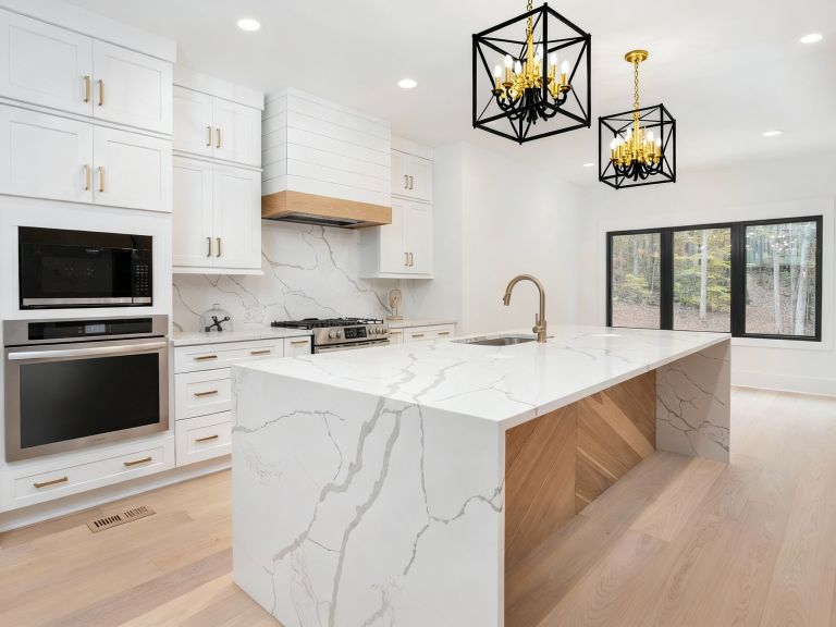
- Kitchen: Greens and yellows encourage energy and appetite. Pair with neutrals for balance.
- Bedroom: Blues, lavenders, or muted greens foster relaxation and sleep.
- Bathroom: Crisp whites with aqua or soft blues create freshness.
- Home Office: Soft greens and blues boost focus, while accents of yellow add creativity.
Bay Area Color Trends for 2025
Bay Area interiors in 2025 are reflecting global color psychology with a local twist:
- Earth-inspired palettes with terracotta, olive, and muted gold
- Nature-driven tones that connect indoor spaces with the outdoors
- Neutrals layered with bold accent walls for balance
- Softer palettes in compact apartments to enhance openness
How to Apply Color Psychology in Your Home
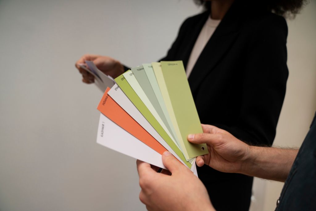
- Start small with accent walls, cushions, or artwork before committing to large-scale changes
- Use natural light to test how colors appear throughout the day
- Pair bold colors with grounding neutrals for balance
- Choose palettes that reflect not only current trends but your long-term lifestyle needs
Sustainable and Healthy Color Choices
Eco-friendly paints and finishes are part of modern color design. Low-VOC and non-toxic paints protect indoor air quality while delivering beautiful finishes. This choice combines aesthetics with wellness, a priority for many Bay Area homeowners.
Final Thoughts
Color psychology offers powerful tools for shaping how spaces feel and function. By understanding the emotional effects of different hues, homeowners can create interiors that are not only beautiful but also supportive of well-being.
From calming blues to energizing yellows, the right palette can transform a room’s purpose and mood. In 2025, Bay Area interiors are embracing earthy, nature-driven tones alongside bold accents, helping homes feel both stylish and deeply personal.